Reelizer Presents: The Top Ten Movie Posters of 2011 (Alternative Artworks)
Before we dive in to this list I thought it would be cool to look back at this past year, which is the first year, of Reelizer.com. It seems appropriate since the bread and butter of the site is exactly what's in this top ten: the fine art of film art. The site does have official one sheets peppered throughout, but the soul of Reelizer is the beautiful interpretation by an artist of another artist's work. And really it's this element—audience and artist having a shared awareness of a piece's inspiration—that makes this type of art so exciting. Because knowing the source and seeing how it gets abstracted is simply engaging.
The site really began as a pitch in the beginning of December 2010. Fittingly, it was an online gallery pitch for Justin Ishmael at Mondo as a way of showcasing, in a single place, all the amazing art the boutique was doing; particularly the huge Star Wars line. Basically I was so inpired by what Mondo was doing that I built a site as a proof-of-concept! Sadly the timing didn't quite work out for it to become a Mondo museum (although it was eventually realized this year with the Mondo Archive which should be permanently bookmarked by everyone) and so I decided to make the scope of the site much larger. Instead of showcasing just movie posters, it became about showcasing all kinds of movie-based contemporary artworks. Which was a wise choice since I soon discovered how much great stuff was out there. 1,100 pieces of stuff on the site and counting as a matter of fact.
Luckily, I wasn't the only one impressed by the level of quality and quantity in this type of art. Throughout the last year, Reelizer has been linked to by the incredibly popular Daring Fireball, tweeted by Jon Favrea and Chuck Pahlaniuk, featured in the print edition of The Guardian Guide, App-isized via the Visn iPhone/iPad App, and quickly turned into a resource for art and poster lovers (with a few film directors contacting me directly to track down the artist behind a poster of their film). And, of course, Devin has been kind enough to let me cross-post content right here on BAD which has helped in awareness greatly. All of it a great confidence builder for a site that makes no money and is maintained purely on the passion of spotlighting the artists who turn the movies we love into art we love just as much.
Ok, so with that selfish nostalgia out of the way onto the reason why you even clicked the link in the first place: The Top Ten Movie Alternative Artworks of 2011. This is the much more fun counterpart to The Top Ten One Sheets of 2011 list from last week. It has a wider variety of styles (apart from the fact that none of them use photos) and deals with movies I assume that almost all of you have seen. Some are official studio licensed artworks, some are commissioned pieces and some are personal projects, but all them turn the hundreds of thousands of moving images that make up a movie into a single artful one. Enjoy.
10. They Live, by Shepard Fairey.
What I love most about this piece (besides the fact that Shepard Fairey is my all-time favorite contemporary designer) is that it's the first—and maybe the only time—where Mondo has commissioned an artist to design a poster for a movie which was the catalyst for that artist's style, career and philosophy. For those that don't know Shepard Fairey, he is the creator behind the "Andre the Giant Has a Posse" sticker campaign of the early nineties. This later morphed into the more well-known "OBEY Giant" campaign and brand, inspired by They Live's "Obey" motto and even the font. Bonus: Check out this intro video that John Carpenter did for the Mondo special screening with Shepard in attendance.
9. Gremlins, by Phantom City Creative.
Seriously, there's got to be something in the Toronto water. Besides Ghoulish Gary Pullin and Jason Edmiston calling that place up north home, there's also Justin Erickson, Creative Director for Phantom City Creative (and recently announced as the new Art Director of Rue Morgue Magazine), who made a huge splash earlier this year with a line of "Back to the 80s" posters done for TIFF Bell Lightbox. This poster is from that series and a great example of why Justin continues to be one of my favorite poster designers. He has a great eye for illustration, typography and composition; turning them into a bold, cohesive whole.
8. Blood Bond, by Julian Callos.
Captures the dark poetry of Let the Right One In through its delicate linework. Besides being a genius with ink, Julian can freaking sculpt too.
7. Blade Runner, by Mateusz Kołek.
I don't know much about Mateusz, but I do know he's a worthy successor to Jamie Hewlett's Manga-fied work. A style that's fitting for a Blade Runner image. Besides all the wonderful detail and endless layers going on in the background, the true star of this piece is the endless layers of expression in Harrison Ford's face.
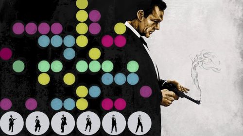
6. Drive, by James White.
International rockstar designer and personal man crush, James White (aka Signalnoise), channels the neon noir of Drive through his own neon inspired aesthetic and trademark geometric style. I love the subtly used textures that give the design an even more kinetic feel. I imagine all sorts of mayhem is happening just outside that driver side window. Full disclosure: James sent me a copy of this print for free. Although it was only after he saw it posted on Reelizer. I'm only disclosing this as proof that he's not just a mega-talented designer, but an extremely nice guy to boot. My man crush continues.
5. The Explorers, by Jack Hudson.
For all the 80s movies that get such nostalgic love, I wonder why Explorers is consistently overlooked. Not that I need some Explorers-inspired gallery exhibition to make me appreciate it (hint, eye wink, noogie noogie Gallery1988), since Jack Hudson's art print does that all on its own. What puts it so high up on the list is that it captures my memory and feeling of the film more accurately then depicting a specific scene or character would. Which is only possible through Jack's whimsical take on the 1985 childhood classic. Strike that, my childhood classic.
4. Jurassic Park, by Aaron Horkey.
If there's one Mondo artist that constantly mesmerizes me with levels of detail that make my eyes explode it's Aaron Horkey. I have this one hanging on my wall and always stop to look at all the nooks and crannies of linework going on. So by 2030 I should be done going through the whole thing. Seriously.
3. Batman Returns, by Boneface.
As mentioned in the intro, I think my favorite thing about movie-based artwork is seeing how an artist applies their style when interpreting a movie. Do they soften their aesthetic to more clearly depict the movie or do they go the other direction and abstract it to the point of being unrecognizable? This piece by UK-based Boneface sits right on the line. He uses his trademark bold colors and accented violence to depict a split second shot in Batman Returns. A move that's also right in line with the sarcastic tone prevalent in most of his work. It's just such a cool marriage of style and substance, turning a shot from a comic book movie into a sexy eye-catching design. I own the non-exhibition version of this print, but it's nothing compared to the stark simplicity of this first version, originally made for the Artoyz & Geek-Art.net's Blockbusterz Artshow.
2. The Shining, by Iron Jaiden.
Screenprint extraordinaire Iron Jaiden channels the horror film classic through this haunting image, drilling it down into your soul. The brilliance is that he does away with stereotypes you see in every piece of artwork inspired by The Shining (the Grady twins, the elevator of blood, the Overlook Hotel carpet pattern, etc.) and instead focuses on the victims of Jack Torrance, evoking the life-long damage he's caused them.
1. Frankenstein, by Drew Struzan.
This breathtaking poster by Drew Struzan defines the term "film art fine art". Everything, from the pyramid composition to the photorealistic oil painting technique, is the legend at his best. It's a poster that was on Drew's list of movies he wish he could've worked on and might've never been realized if it weren't for Mondo actively becoming involved. They turned it from a wishlist entry into a remarkable screenprint. Now if Mondo could do the same thing with Drew's Blade Runner poster I would die a happy man. Bonus: Check out this Mondo video recap of the Frankenstein screenprint release.
So there you have it folks, the Top Ten Movie Artworks of 2011. You can see some of the ones that barely made the list on my Pinterest Board. And for those going to SXSW this March stay tuned for more news regarding a panel I'm moderating that includes Justin Ishamel from Mondo and artists Sam Smith, Justin Erickson and Akiko Stehrenberger. Hell yeah.


