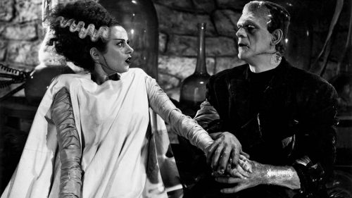
Cubist FRANKENSTEIN
Thats' cubist, right? I won't lie - the fine arts are not my strong point. I'm fully expecting to get schooled in the comments by somebody who knows better. But I think that's cubism.
It sure as shit ain't 'minimalism,' which is the most tired form of fanmade movie posters. I love the coloring and layout of this poster, by Szoki. I love how the Monster pushes up against the top of the frame, barely contained, crouched in a position of supreme discomfort. It really captures the tragedy.


