Reelizer’s Top 10 Alternative Movie Posters of 2013
After taking a hiatus last year in posting a 'best of' I'm back to present a more refined list, fixing issues I've had in compiling something like this.
First, the list qualifier I had in mind when combing through this year's releases was "favorite". I hate the idea of calling anything "best", particularly when it comes to visual art. Beauty is in the—ah, you know the rest.
Second, I focused the idea of what an alternative movie poster is. To me it's a combination of image and type, just like a standard one-sheet. There's a lot of great character portraits and scene recreations out there, but it's that melding of typography and imagery that is essential to a movie poster. It's a constraint that the artist must deal with in composing a piece, a constraint that pushes towards a solution that couldn't be arrived at without it. Just imagine how less impactful Sam Smith's legendary HOUSE poster without the quivering letterforms framing Blanche's face.
The list contains a mix of explorations, concepts, alternate one-sheets and gallery pieces. Three are from from Mondo. No apologies there. They have the greatest taste in art direction in the business. Far too many alternative movie posters play on a gimmick (the minimalist trend must die) or a prop, which is a cool exercise, but never produces something you'd want to hang on your wall. Mondo knows this well and they'll hammer on concepts until they get it right, or if they don't, then cancel a poster entirely.
Also, this list isn't ranked in any order. It's just a freewheeling stream of visual goodness.
Now onto the list!
Brandon Schaefer, Nosferatu
FrightFest Originals
Brandon has been on a tear this year. He's produced one gorgeous poster after another for Drafthouse Films and IFC, written in-depth articles for his column The Art House, and continues to curate the cinema art showcase at Silver Screen Society. Amidst all of that he also managed to create this distinct take on the legendary German horror film. I love the use of a single light source to illuminate the scenery and backlight Count Orlok. It's illustrative cinematography. The brilliant touch though is the grain overlaying the image. It echos the experience of watching the film, giving it movement, so that with every blink you expect Orlok to be one step closer to gripping your throat.
Akiko Stehrenberger, Spring Breakers
A24
The movie poster world is a better place because of Akiko. The slogan for Reelizer is "the fine art of film art" and her work exemplifies that. She's a master of every medium, whether it's digital art, photography or painted media like this piece. Here, the entire surreal universe of Spring Breakers is captured in a single portrait. A Mona Lisa for the millennials.
Sam Smith, The Dynamation of Ray Harryhausen
The Belcourt Theatre
The god of handcrafted visual effects is respectfully honored by this handcrafted Sam Smith masterpiece. The interplay of line weights is mesmerizing, but it's the atypical choice in color that really makes it sing.
Midnight Marauder, Gladiator
Concept
From the towering statue head to the red slit trickling off of Maximus's sword, this one is all about the perfect ratio of the macro and micro. Everything is sized and placed for the greatest impact. If Gladitor was an opera this would be the cover to the program.
Jay Shaw, Graceland
Mondo/Drafthouse Films
Jay has been and continues to be my favorite poster artist. Perhaps it's because we share similar tastes in classic Polish poster design where a movie is abstracted to the outermost edges of the psyche and then distilled into a striking image. The unpredictability is exciting, but the limitless potential concepts could drive most artists insane. Jay, by some freakishly inhuman instinct, nails "The Idea" every single time. With the kidnapping thriller Graceland he depicts the lost of innocence at the hands of corruption and manages to make it look beautiful.
Grzegorz Domaradzki, Kurtz’s Nightmare
Bottleneck Gallery, Where Is My Mind?
Kurtz omnipresent, lurking above the river that carries his death. The hurried scribbles of text upsetting the symmetry of it all. It's a visual tone poem done masterfully.
Phantom City Creative, You’re Next
ignition Print
Justin Erickson, the Creative Director of Phantom City Creative, is a monster when it comes to his illustration and layout skills. He has a clear instinct in the graphic design of a piece and what illustration style is needed to bring it all together. In this un-used poster exploration for You're Next the emphasis of image and type is wisely reversed. The splattered typography gets across the title, but also acts as backdrop for Fox Mask who's rendered in beautifuly sharp detail.
Anthony Petrie, Constructivist Pugilist Manifest No. 4
Gallery 1988's Crazy 4 Cult Presents: Say Hi To The Bad Guy
If this were illustrated any another way it wouldn't be as distinct. Very few times does style trump concept, but it's the meticlous layering of those jagged shadows that makes the piece. You get a sense of the rippling muscle and the pain it inflicts. The use of Russian letterforms and a propaganda-inspired composition are perfect compliments to a design that has you screaming from Drago's corner.
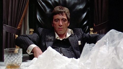
Mike Mitchell, Scarface (Variant)
Mondo
The visage of Tony Montana has been recreated countless times by countless artists, but none have captured the utter badassness with such clarity and simplicty. This is the Scarface movie poster to beat for years to come.
Tomer Hanuka, Psycho
Mondo
If I were to have ranked this list then Tomer's take on Hitchcock's masterpiece would be #1. There have been countless interpretations of Psycho, but none have captured the intimacy of murder like this. That's what I love most about alternative movie posters, it's the joy in being surprised by an artist's translation of another artist's work. Here, Tomer forces us to witness poor Marion Crane's post-mortem removal. The aesthetics carry the idea even further with the fluidity in the line work making us feel the crink in Marion's back being twisted onto the floor and the out-of-focus countertop enforcing our point-of-view.
Explore more alternative movie posters at Reelizer.com.