Luca Guadagnino Has An Answer For Anyone Concerned About SUSPIRIA’s Lack Of Color
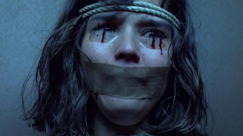
Maybe you've seen the trailers for Luca Guadagnino's forthcoming Suspiria remake. Maybe they've left you excited (as has been the case among the BMD Team), maybe they've left you enraged (as has been the case with a few passionate fans of the original). Whatever the case may be, it's almost certain that you've taken note of how Guadagnino's film looks.
Which is to say: very much not like Dario Argento's Suspiria.
Your mileage may vary on this point - from where we're standing, the fact that Guadagnino didn't attempt to ape Argento's style is one of its biggest selling points - but if you're curious why that choice was made, The Hollywood Reporter's new interview with Guadagnino has answers.
Says the director:
"I think Suspiria by me is extremely rich in colors, except that we went for a different take. Dario Argento and let’s face it, Luciano Tovoli, his wonderful D.P., they decided to go for an extremely expressionistic way of decoding horror, which started from the work of Mario Bava. The way in which they made those colors — not just simple gels in front of lights, they were using velvet and they were really sculpting the light — [that] has influenced filmmakers for so long. I think everything that could have been said through that style has been said."
But wait: there's much more.
"For me, I always think of the setting of the story before I decide anything about the light and the color of my films. And this is a movie about Berlin, 1977, a country that is almost on the verge of civil war, where there is a great generational divide, where the horrors of the past are confronted by the urgency and the violence of the present, a period that was called the German Autumn. We started to see the pictures of the time, and in particular the wonderful lesson of [cinematographer] Michael Ballhaus in the films of Rainer Fassbinder. And we started to think of how a great painter like Balthus created such uncanny eeriness and fear in his amazing paintings. And that led me, my production designer Inbal Weinberg, my costume designer Giulia Piersanti and the director of photography Sayombhu Mukdeeprom to go for browns and blacks and blues and greens, all muted and juxtaposed, so that we could in a way encompass this idea of a German Autumn. That’s why the colors are not primary. They do not pop at you. I hope that they infiltrate you and they go deep into you."
This all sounds completely reasonable to us. Thoughtful, even. We didn't think Guadagnino had made this decision arbitrarily (when watching one of this director's films, one does not get the impression that any decision has been made arbitrarily), but now we've got a perfectly good explanation to point to the next time someone gets bent outta shape about Suspiria's lack of glaring red lights.
Here's a bonus quote from the same interview, wherein Guadagnino shares his hopes and dreams for how the new Suspiria may sit with audiences:
"I hope that the movie comes across as a relentless experience that’s going to go deep into your skin all the way down into your spine. I want the movie to perform as the most disturbing experience you can have. The movie is about being immersed in a world of turmoil and uncompromising darkness."
All of this sounds great to us.
Head on over to THR to read the rest of their interview, or just mosey on down to the space provided below to weigh in with your opinion on the above. Think it sounds like Guadagnino knows what he's doing? Wish he'd leave well enough alone? Are you simply excited to know that you will soon live in a world with two wildly different versions of Suspiria to choose from? Sound off in the comments below, and stay tuned for further Suspiria updates as we draw ever closer to the film's release.


