Letters From Outer Space: Exploring The Typeface Of AD ASTRA
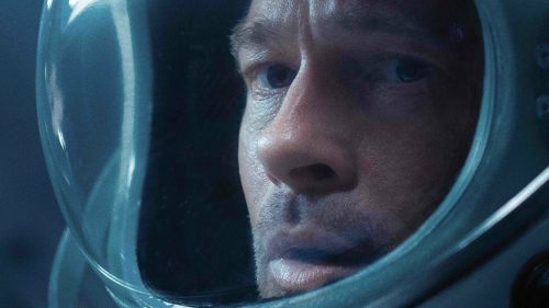
If you look at the poster for James Gray’s Ad Astra, what, beyond the fact that the movie stars Brad Pitt, do the letters tell you? They’re bold, white, rounded, with the non-essential fractions of some characters missing: the sleek typographic economy of a futuristic tale. Focused on Astronaut Roy McBride (Pitt), who has been tasked with heading to the edge of the solar system to find his long lost father, the film is set predominantly in space, where a voyage to Neptune can be completed in the length of a school term. Futurist seems like the right fit. But the director won’t tell you that.

While the font on the poster recalls the crisp circles of 2001: A Space Odyssey and the imposing dread-inducing diagonals of Alien, when you actually watch the film, the opening titles of Ad Astra are far more down to earth. The words ‘The Near Future’ are the first on screen, but the style is not so much Kubrick’s Odyssey as Homer’s. Title designer Richie Adams was told “simple and nothing too futuristic” by director James Gray; so, using as a starting point the Latin of the film’s title, rather than travel to the future, he traveled to the past – roughly 1900 years back.

“I referenced early presentations of type used in ancient Rome, specifically that of the type featured at the base of Trajan’s Column,” he says. “I’ve been waiting for the right opportunity to use Trajan in a main title, as designers feel it is overused [see posters of Titanic, Quiz Show, The Bodyguard and many more], but with the title being in Latin it seemed to make sense.”
Trajan can be a bit of one-size-fits-all, the roman characters suggest authority and trust, it’s the kind of font that gets selected from a drop down menu when a resume is about to be written. In the case of Ad Astra however, the letters don’t completely exude power; on top of a black sky, the fine serifed strokes at the edge of the letters, that would be typically elegant whilst resting on a white page, now seep ominously into the void. This menacing consumption of words extends further when the camera pans away from the title, and rather than letting it carousel off-screen, the letters are sucked into overlapping darkness, caught before they can escape. As well as the shape of the letters, the colour of them comes as a surprise: a scorched red that feels more like it’s been cut from clay than found amongst the stars. While crisp whites may have been out, the serifed red-on-black name plate of Blade Runner does spring to mind.
“Red, to me, offers somewhat of an unsettling tone, which hints at the story to come – and given James’s direction to avoid anything too futuristic or effects heavy, I wanted to offer something classic,” says Adams.
After handing in the Trajan version of his Ad Astra titles, Richie got to work on some more ideas, this time a bit more typically futuristic. He presented the collection to Gray, receiving the equally great and frustrating news that he had got it right the first time. (Gray comments that Richie “absorbs the film and allows his own work merely to serve it and, in doing so, he expands the meaning of the film… he seemed to get at the heart of the classical nature of the work almost instantly.”)
Classic title cards is something the Louisiana-based artist knows about, having worked for a number of years under the tutorship of designer Richard Greenberg, who, if not renowned by name, surely is for his work on Alien, Superman, Blow Out and Dirty Dancing. Adams says that Greenberg, as well as boasting a commanding knowledge of Los Angeles restaurants, was responsible for discovering and nurturing many young designers; and he just happened to be teaching at the Otis School of Art and Design when Adams was studying there.
“I showed him my reel, and he said, ‘I may have a job for you,’” Adams remembers. “I’m thinking it’s to design the titles for his daughter’s wedding video or something like this, and it ends up being the titles for Star Trek: Nemesis.” Similarly to Ad Astra, the type choice for Nemesis disregarded traditionally sci-fi forms (and was boldly a font that was not recognisably Trek), instead using Exocet, a font styled after Greek and Roman carvings. Made up of straight lines and circles, cut down the middle, Exocet’s letters could be mirrored, making it a perfect letterhead for the Enterprise’s clone encounter that would follow.
After contributing to the typographic legacy of Star Trek, Adams was offered a position at Greenberg’s company. He would become creative director, work on franchises like Terminator, eat lunch with his mentor and friend every day, and be inspired by his practical approach to titling, challenged to distill each idea into the finest reflection of the film ahead of it.
“He did the original streaking titles on Superman before they had computers to support such an effort. He would figure out a method based on the concept he was after.” As with the first poster for Superman - which didn’t show Christopher Reeve, just a blazing rainbow whoosh, slicing through a somber sky - the titles translated so much of his character, without revealing him. The words are pure brightness against the darkness of the sky, the streaking providing the sense of flight, and as the letters dragged closer to the front of the screen, swooping up in a single bound, the light triumphing over the dark.
“Start with a great concept, and try to do something that no one has ever seen before” was Greenberg’s maxim. (Easy!) And a ‘great concept’ was perhaps never executed better than with Alien, in which the stems of each letter dauntingly emerge out of the darkness, drawing out fear, not jumping at you with it, and bone by bone, building the imagined threat of the Alien itself, a long time before it appears on screen. “Alien is amazing,” says Adams, acutely covering the xenomorph’s title card characteristics. “It’s simple, graphic and unexpected. It’s also beautiful.”
Greenberg was always interested in pushing the capabilities of his designs. After being asked about work that he felt should be more regarded, Adams highlights his teacher’s efforts on James Cameron’s True Lies, referring to it as “another powerful yet simplistic reveal. This was an example of Richard’s simple, thoughtful approach, while pushing the boundaries of the medium. That sequence was done completely in 3D/CG, which Richard was not accustomed to using – but it served the concept.”. Starring Arnold Schwarzenegger as Harry Tasker, a secret agent with a double life, the titles begin with hulking blue-on-black letters spelling ‘True’, punching on screen. Then they start to twist, turning into 3D blocks and revealing the ‘Lies’ hidden in the letters all along. It’s a perfect refinement of the film title’s dichotomy; truth and deception, when viewed from the right angle, becoming uncomfortably close neighbours.
Greenberg’s most recognised work was made before the advent of digital technology, and some of Adams’s 21st-century titles have tried to hark back to his mentor’s old-world tactility. In particular, the teaser trailer for the Tom Cruise thriller The Last Samurai, in which Adams “rigged a real-life samurai sword to cut through billowing silk, with pre-printed Kanji lettering for its dynamic reveal”. A more recent Tom Cruise vehicle, American Made, featured graphics designed in a computer, exported to analog VHS and then re-digitised for an authentically scratchy effect. Always in search of the perfect concept, despite the practical challenges, these are the kind of approaches Greenberg, who sadly passed away last year, would be proud of.
In a way, Ad Astra’s titles maintain Greenberg’s spirit, because even though Trajan has appeared on hundreds of film posters and will appear on a hundred more, even though it is something audiences have seen before, here, executed in the right way, it’s a brand new concept. As much as Ad Astra is a film about looking forward, it is about looking back, at our homes and the people who make us. Progress can only come from acknowledging the past, asking whether to embrace it, learn from it, or set it aside and attempt to create a new path amongst the stars. That might not be apparent straight away, but with a closer look, it’s in its very first words.